
446 lines
26 KiB
Markdown
446 lines
26 KiB
Markdown
# SRE math every engineer should know: a practical guide
|
||
|
||
- **期号**: SRE Weekly Issue #496(2025-11-09)
|
||
- **作者**: Srivatsa RV — One2N
|
||
- **链接**: https://one2n.io/blog/sre-math-every-engineer-should-know-a-practical-guide
|
||
|
||
## 简介
|
||
|
||
You don’t have to be a mathematician, but understanding a few key concepts is critical for an SRE.
|
||
|
||
## 正文
|
||
|
||
### [Introduction: why math matters in Site Reliability Engineering](https://one2n.io#introduction-why-math-matters-in-site-reliability-engineering)
|
||
|
||
It is 2 a.m. Your PagerDuty goes off while you see Slack filled with messages from the product team: customers cannot complete their checkout. You open Grafana. The dashboard says average latency is stable at 200 ms. To a casual reader, this looks fine. But your users are feeling the heat with delays, and frustration builds up.
|
||
|
||
This is a familiar problem in Site Reliability Engineering. Dashboards provide numbers, but numbers alone do not explain the system. Averages, CPU, and throughput plots are misleading if you do not know the math behind them. At One2N, our SRE practice has seen this many times. What separates a reactive engineer from a confident SRE is not more dashboards but the ability to interpret them correctly.
|
||
|
||
The math is simple, not academic. Percentiles show you tails that averages hide. Little’s Law ties latency to throughput. Error budgets translate abstract percentages into downtime minutes. Queueing theory explains why systems collapse suddenly at high utilisation. Graph literacy helps you avoid being tricked by clean-looking dashboards. This article brings these concepts together into a single guide.
|
||
|
||
### [Percentiles in SRE: why averages hide user pain](https://one2n.io#percentiles-in-sre-why-averages-hide-user-pain)
|
||
|
||
Monitoring tools often default to averages. Averages produce neat, smooth lines that make dashboards easy to read. But averages lie. They erase the very slow requests that cause frustration.
|
||
|
||
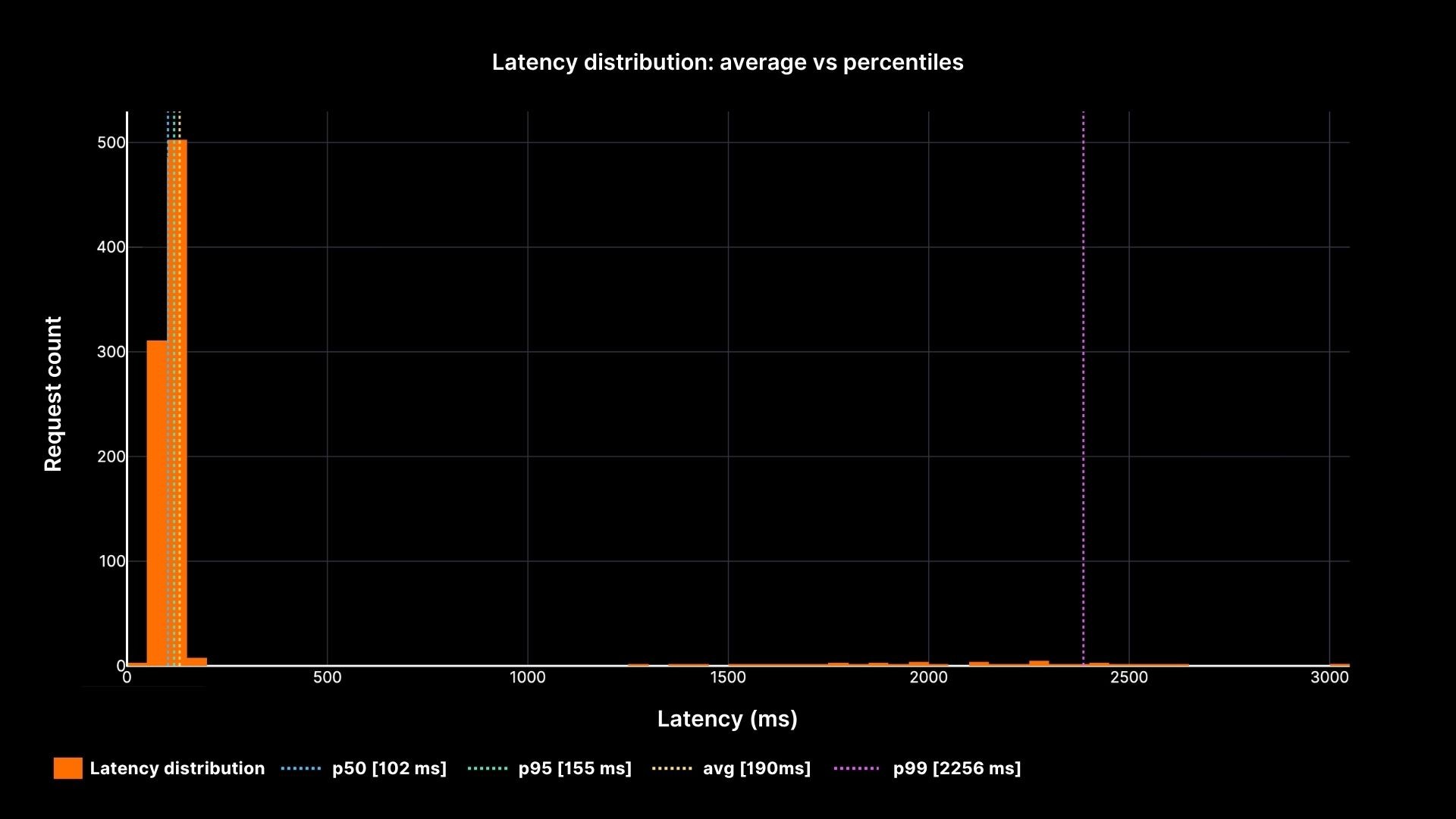
Imagine this case. Your system handles 1,000 requests in about 100 milliseconds each. At the same time, 50 requests take between two and five seconds. The average works out around 200 ms. The graph is flat, steady, and looks perfectly normal. But the 50 users who waited seconds had a broken experience. They are the ones raising tickets, retrying in anger, and leaving the app.
|
||
|
||
Percentiles capture this distribution more honestly. The **p50 (median)** tells you what the middle request saw half faster, half slower. The **p95** shows where performance begins to degrade: 5 percent of requests were worse than this point. The **p99** reveals the tail: the slowest one percent. In large-scale systems that process thousands of requests per second, that “one percent” still means thousands of unhappy users every minute.
|
||
|
||
### [Latency Distribution](https://one2n.io#latency-distribution)
|
||
|
||
|
||
|
||
**Latency distribution: average vs percentiles**
|
||
|
||
The chart shows how the average (yellow line) stays calm while the p95 and p99 percentiles reveal the painful slow tail. This is why every SRE must speak in percentiles, not averages.
|
||
|
||
### [Latency and Throughput: two sides of the same coin](https://one2n.io#latency-and-throughput-two-sides-of-the-same-coin)
|
||
|
||
Latency is the time one request takes. Throughput is the number of requests per second. They are not separate metrics; they are tied together by **Little’s Law**.
|
||
|
||
**L = λ × W**
|
||
|
||
- L = number of concurrent requests in the system
|
||
- λ = arrival rate (req/sec)
|
||
- W = average latency (seconds)
|
||
|
||
Think about a coffee shop. Ten customers arrive every minute. Each stays five minutes. At any given time, there are about 50 people inside. If arrivals double and staff do not, queues form.
|
||
|
||
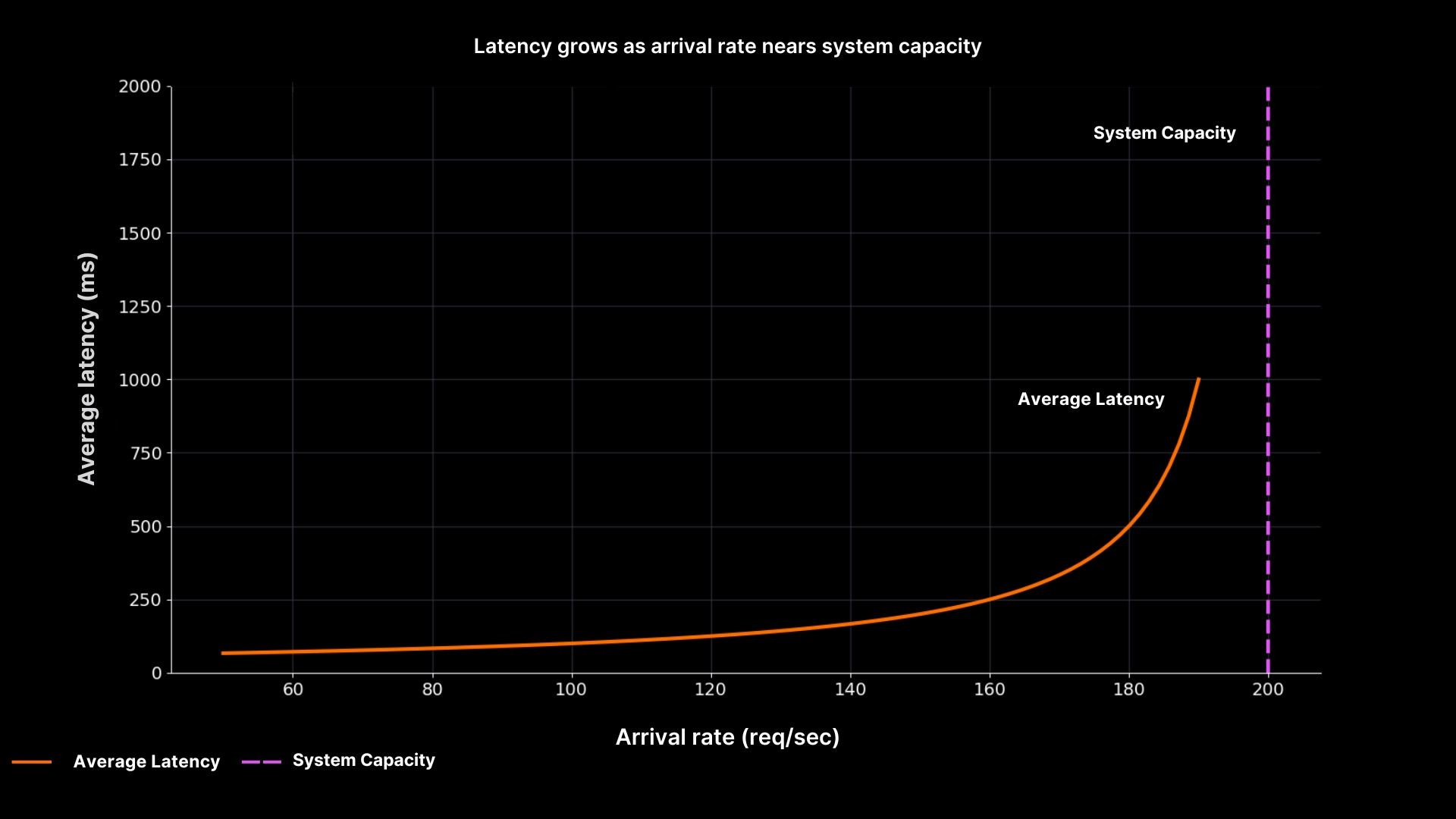
Systems behave the same way. As arrival rates push closer to system capacity, latency grows sharply.
|
||
|
||
### [Latency vs Load](https://one2n.io#latency-vs-load)
|
||
|
||
|
||
|
||
**Latency grows as arrival rate nears system capacity**
|
||
|
||
The plot makes the relationship clear. Latency stays low when utilisation is modest, but as arrival rate approaches capacity (200 req/sec), latency shoots upward. This is why SREs at One2N recommend designing for slack aiming for 60–70% utilisation in steady state, not squeezing servers to 95% “efficiency.”
|
||
|
||
### [Error Budgets: turning percentages into downtime minutes](https://one2n.io#error-budgets-turning-percentages-into-downtime-minutes)
|
||
|
||
Service Level Objectives (SLOs) are often expressed as percentages: 99.9%, 99.99%, and so on. These numbers sound good in slides, but they are meaningless until you convert them into real downtime.
|
||
|
||
- 99.9% uptime allows about **43 minutes** of downtime per month.
|
||
- 99.99% allows about **4 minutes** per month.
|
||
- 99.999% allows only **26 seconds** per month.
|
||
|
||
Understanding these numbers changes the way you handle incidents. If you lose an hour to latency or outage in a 99.9% system, the budget is gone for the month. If you are already at the edge of your budget, pushing another risky release could tip you over.
|
||
|
||
Error budgets connect engineering and business. They tell you when it is safe to release fast and when you must slow down. They keep conversations grounded in math instead of gut feel.
|
||
|
||
### [Queueing in SRE: why high utilisation breaks systems](https://one2n.io#queueing-in-sre-why-high-utilisation-breaks-systems)
|
||
|
||
Even if average latency looks fine and error budgets are intact, queues can change the picture in seconds. Queues form whenever demand gets close to capacity, and the growth is not linear, it is explosive.
|
||
|
||
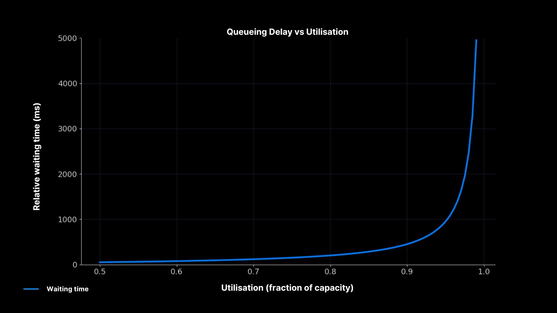
At 50% utilisation, requests pass smoothly. At 80%, queues start to show up. At 90%, even small bursts of traffic push waiting times through the roof. This is why “90% CPU” should not make you feel efficient; it should make you nervous.
|
||
|
||
We’ve seen this play out at One2N. Chinmay highlighted in a [recent talk](https://one2n.io/talks/just-enough-queuing-theory-to-be-dangerous) that queueing theory is practical, not just theoretical. Understanding these patterns is key to spotting incidents before they grow out of control.
|
||
|
||
### [Queueing Delay vs Utilisation](https://one2n.io#queueing-delay-vs-utilisation)
|
||
|
||
|
||
|
||
Waiting time soars near 100% utilisation
|
||
|
||
The curve explains why systems collapse suddenly. Waiting time grows slowly at first, but once utilisation passes ~85–90%, even a small spike in arrivals causes delays to blow up. For SREs, this is the math behind the advice to run with headroom instead of chasing high utilisation.
|
||
|
||
### [Graph Literacy: reading dashboards without being fooled](https://one2n.io#graph-literacy-reading-dashboards-without-being-fooled)
|
||
|
||
Even when you track percentiles, throughput, and error budgets, you can still misread dashboards. Graphs are not truth they are a representation. Many incidents are prolonged because engineers trusted the wrong graph.
|
||
|
||
### [Common mistakes explained](https://one2n.io#common-mistakes-explained)
|
||
|
||
- **Averages instead of percentiles:** A flat average hides the tail. Always ask what kind of metric you are looking at.
|
||
- **Sampling windows:** A one-minute average smooths spikes that are visible on five-second windows. Short windows often show the real stress.
|
||
- **Axis scale:** A log scale compresses big spikes into small bumps. Always check if the axis is linear or log.
|
||
- **Heatmaps:** They can look calm, but if most of the density is at the top, it signals trouble.
|
||
|
||
### [How to build safe habits](https://one2n.io#how-to-build-safe-habits)
|
||
|
||
Instead of memorising rules, practice slow thinking when reading graphs. Start by asking what the metric means. Then check the window and the scale. Compare across related metrics: if CPU is flat but latency rises, check the queue length. Finally, match metrics with reality do they explain the user complaints? Graphs only help if they connect back to what customers experience.
|
||
|
||
### [Putting it all together: an on-call scenario](https://one2n.io#putting-it-all-together-an-on-call-scenario)
|
||
|
||
At 2 a.m., the pager fires. Users cannot check out. Average latency is flat at 200 ms. Without math, you would trust the graph and assume the problem is elsewhere. With SRE math, you follow a better path.
|
||
|
||
First, you check percentiles. p95 shows 2 seconds, p99 shows 5 seconds. The tail is red hot. Next, you look at throughput. The system is running at 180 requests per second, close to the 200 req/sec capacity. That explains why queues are forming. You calculate the [error budget](https://one2n.io/error-budget-calculation-downtime-minutes-for-every-slo) impact: if this continues for an hour, the team will burn 60 minutes, more than a month’s allowance for a 99.9% SLO. Finally, you examine queues directly. Depth is climbing, confirming that high utilisation is the root cause.
|
||
|
||
Armed with this, you act. You slow down releases because the budget is nearly gone. You add temporary capacity to cut the queues. In the post-incident review, you show your team the percentiles, the throughput vs latency curve, and the queueing math. Everyone leaves with a clearer picture of how the system actually behaves.
|
||
|
||
### [Conclusion: SRE math as a toolkit](https://one2n.io#conclusion-sre-math-as-a-toolkit)
|
||
|
||
SRE math is not about complex equations. It is about seeing systems honestly. Percentiles expose the pain hidden by averages. Little’s Law explains why latency rises with load. Error budgets translate uptime into real minutes. Queueing theory warns why high utilisation is unsafe. Graph literacy ensures dashboards tell you the truth.
|
||
|
||
At One2N, we treat these as essential skills. They make you a better on-call engineer, a stronger teammate, and a clearer decision-maker. Master these basics, and you move from reacting to incidents to understanding them. That is what Site Reliability Engineering is meant to be.
|
||
|
||
### [Introduction: why math matters in Site Reliability Engineering](https://one2n.io#introduction-why-math-matters-in-site-reliability-engineering)
|
||
|
||
It is 2 a.m. Your PagerDuty goes off while you see Slack filled with messages from the product team: customers cannot complete their checkout. You open Grafana. The dashboard says average latency is stable at 200 ms. To a casual reader, this looks fine. But your users are feeling the heat with delays, and frustration builds up.
|
||
|
||
This is a familiar problem in Site Reliability Engineering. Dashboards provide numbers, but numbers alone do not explain the system. Averages, CPU, and throughput plots are misleading if you do not know the math behind them. At One2N, our SRE practice has seen this many times. What separates a reactive engineer from a confident SRE is not more dashboards but the ability to interpret them correctly.
|
||
|
||
The math is simple, not academic. Percentiles show you tails that averages hide. Little’s Law ties latency to throughput. Error budgets translate abstract percentages into downtime minutes. Queueing theory explains why systems collapse suddenly at high utilisation. Graph literacy helps you avoid being tricked by clean-looking dashboards. This article brings these concepts together into a single guide.
|
||
|
||
### [Percentiles in SRE: why averages hide user pain](https://one2n.io#percentiles-in-sre-why-averages-hide-user-pain)
|
||
|
||
Monitoring tools often default to averages. Averages produce neat, smooth lines that make dashboards easy to read. But averages lie. They erase the very slow requests that cause frustration.
|
||
|
||
Imagine this case. Your system handles 1,000 requests in about 100 milliseconds each. At the same time, 50 requests take between two and five seconds. The average works out around 200 ms. The graph is flat, steady, and looks perfectly normal. But the 50 users who waited seconds had a broken experience. They are the ones raising tickets, retrying in anger, and leaving the app.
|
||
|
||
Percentiles capture this distribution more honestly. The **p50 (median)** tells you what the middle request saw half faster, half slower. The **p95** shows where performance begins to degrade: 5 percent of requests were worse than this point. The **p99** reveals the tail: the slowest one percent. In large-scale systems that process thousands of requests per second, that “one percent” still means thousands of unhappy users every minute.
|
||
|
||
### [Latency Distribution](https://one2n.io#latency-distribution)
|
||
|
||

|
||
|
||
**Latency distribution: average vs percentiles**
|
||
|
||
The chart shows how the average (yellow line) stays calm while the p95 and p99 percentiles reveal the painful slow tail. This is why every SRE must speak in percentiles, not averages.
|
||
|
||
### [Latency and Throughput: two sides of the same coin](https://one2n.io#latency-and-throughput-two-sides-of-the-same-coin)
|
||
|
||
Latency is the time one request takes. Throughput is the number of requests per second. They are not separate metrics; they are tied together by **Little’s Law**.
|
||
|
||
**L = λ × W**
|
||
|
||
- L = number of concurrent requests in the system
|
||
- λ = arrival rate (req/sec)
|
||
- W = average latency (seconds)
|
||
|
||
Think about a coffee shop. Ten customers arrive every minute. Each stays five minutes. At any given time, there are about 50 people inside. If arrivals double and staff do not, queues form.
|
||
|
||
Systems behave the same way. As arrival rates push closer to system capacity, latency grows sharply.
|
||
|
||
### [Latency vs Load](https://one2n.io#latency-vs-load)
|
||
|
||

|
||
|
||
**Latency grows as arrival rate nears system capacity**
|
||
|
||
The plot makes the relationship clear. Latency stays low when utilisation is modest, but as arrival rate approaches capacity (200 req/sec), latency shoots upward. This is why SREs at One2N recommend designing for slack aiming for 60–70% utilisation in steady state, not squeezing servers to 95% “efficiency.”
|
||
|
||
### [Error Budgets: turning percentages into downtime minutes](https://one2n.io#error-budgets-turning-percentages-into-downtime-minutes)
|
||
|
||
Service Level Objectives (SLOs) are often expressed as percentages: 99.9%, 99.99%, and so on. These numbers sound good in slides, but they are meaningless until you convert them into real downtime.
|
||
|
||
- 99.9% uptime allows about **43 minutes** of downtime per month.
|
||
- 99.99% allows about **4 minutes** per month.
|
||
- 99.999% allows only **26 seconds** per month.
|
||
|
||
Understanding these numbers changes the way you handle incidents. If you lose an hour to latency or outage in a 99.9% system, the budget is gone for the month. If you are already at the edge of your budget, pushing another risky release could tip you over.
|
||
|
||
Error budgets connect engineering and business. They tell you when it is safe to release fast and when you must slow down. They keep conversations grounded in math instead of gut feel.
|
||
|
||
### [Queueing in SRE: why high utilisation breaks systems](https://one2n.io#queueing-in-sre-why-high-utilisation-breaks-systems)
|
||
|
||
Even if average latency looks fine and error budgets are intact, queues can change the picture in seconds. Queues form whenever demand gets close to capacity, and the growth is not linear, it is explosive.
|
||
|
||
At 50% utilisation, requests pass smoothly. At 80%, queues start to show up. At 90%, even small bursts of traffic push waiting times through the roof. This is why “90% CPU” should not make you feel efficient; it should make you nervous.
|
||
|
||
We’ve seen this play out at One2N. Chinmay highlighted in a [recent talk](https://one2n.io/talks/just-enough-queuing-theory-to-be-dangerous) that queueing theory is practical, not just theoretical. Understanding these patterns is key to spotting incidents before they grow out of control.
|
||
|
||
### [Queueing Delay vs Utilisation](https://one2n.io#queueing-delay-vs-utilisation)
|
||
|
||

|
||
|
||
Waiting time soars near 100% utilisation
|
||
|
||
The curve explains why systems collapse suddenly. Waiting time grows slowly at first, but once utilisation passes ~85–90%, even a small spike in arrivals causes delays to blow up. For SREs, this is the math behind the advice to run with headroom instead of chasing high utilisation.
|
||
|
||
### [Graph Literacy: reading dashboards without being fooled](https://one2n.io#graph-literacy-reading-dashboards-without-being-fooled)
|
||
|
||
Even when you track percentiles, throughput, and error budgets, you can still misread dashboards. Graphs are not truth they are a representation. Many incidents are prolonged because engineers trusted the wrong graph.
|
||
|
||
### [Common mistakes explained](https://one2n.io#common-mistakes-explained)
|
||
|
||
- **Averages instead of percentiles:** A flat average hides the tail. Always ask what kind of metric you are looking at.
|
||
- **Sampling windows:** A one-minute average smooths spikes that are visible on five-second windows. Short windows often show the real stress.
|
||
- **Axis scale:** A log scale compresses big spikes into small bumps. Always check if the axis is linear or log.
|
||
- **Heatmaps:** They can look calm, but if most of the density is at the top, it signals trouble.
|
||
|
||
### [How to build safe habits](https://one2n.io#how-to-build-safe-habits)
|
||
|
||
Instead of memorising rules, practice slow thinking when reading graphs. Start by asking what the metric means. Then check the window and the scale. Compare across related metrics: if CPU is flat but latency rises, check the queue length. Finally, match metrics with reality do they explain the user complaints? Graphs only help if they connect back to what customers experience.
|
||
|
||
### [Putting it all together: an on-call scenario](https://one2n.io#putting-it-all-together-an-on-call-scenario)
|
||
|
||
At 2 a.m., the pager fires. Users cannot check out. Average latency is flat at 200 ms. Without math, you would trust the graph and assume the problem is elsewhere. With SRE math, you follow a better path.
|
||
|
||
First, you check percentiles. p95 shows 2 seconds, p99 shows 5 seconds. The tail is red hot. Next, you look at throughput. The system is running at 180 requests per second, close to the 200 req/sec capacity. That explains why queues are forming. You calculate the [error budget](https://one2n.io/error-budget-calculation-downtime-minutes-for-every-slo) impact: if this continues for an hour, the team will burn 60 minutes, more than a month’s allowance for a 99.9% SLO. Finally, you examine queues directly. Depth is climbing, confirming that high utilisation is the root cause.
|
||
|
||
Armed with this, you act. You slow down releases because the budget is nearly gone. You add temporary capacity to cut the queues. In the post-incident review, you show your team the percentiles, the throughput vs latency curve, and the queueing math. Everyone leaves with a clearer picture of how the system actually behaves.
|
||
|
||
### [Conclusion: SRE math as a toolkit](https://one2n.io#conclusion-sre-math-as-a-toolkit)
|
||
|
||
SRE math is not about complex equations. It is about seeing systems honestly. Percentiles expose the pain hidden by averages. Little’s Law explains why latency rises with load. Error budgets translate uptime into real minutes. Queueing theory warns why high utilisation is unsafe. Graph literacy ensures dashboards tell you the truth.
|
||
|
||
At One2N, we treat these as essential skills. They make you a better on-call engineer, a stronger teammate, and a clearer decision-maker. Master these basics, and you move from reacting to incidents to understanding them. That is what Site Reliability Engineering is meant to be.
|
||
|
||
##### **Share**
|
||
|
||
##### **Share**
|
||
|
||
###### On this page
|
||
|
||
###### Section
|
||
|
||
###### On this page
|
||
|
||
##### **In this post**
|
||
|
||
section
|
||
|
||
##### **Share**
|
||
|
||
##### **Related Content**
|
||
|
||
|
||
Kong API Gateway for Gaming and Sports Betting Integrations
|
||
|
||

|
||
|
||
|
||
Modernising Observability for a Billion Dollar Revenue Gaming Platform
|
||
|
||

|
||
|
||
|
||
How we reduced Kafka message latency by 90% and increased throughput 4x for a $300M SaaS platform.
|
||
|
||

|
||
|
||
|
||
Migrating from Heroku PaaS to AWS.
|
||
|
||
|
||
|
||
|
||
OpenSearch Workload Management (WLM): How to Control Heavy Search Queries
|
||
|
||

|
||
|
||
|
||
Git was not built for multiple AI agents. Worktrees fix that.
|
||
|
||

|
||
|
||
|
||
How Queueing Theory Makes Systems Reliable
|
||
|
||

|
||
|
||
|
||
Error Budget Calculation: Downtime Minutes for every SLO
|
||
|
||

|
||
|
||
# **Continue reading****.**
|
||
|
||
|
||
Read Blog
|
||
|
||
##### OpenSearch Workload Management (WLM): How to Control Heavy Search Queries
|
||
|
||
Srivatsa RV
|
||
|
||
SRE @One2N
|
||
|
||
###### Learn how OpenSearch Workload Management (WLM) isolates heavy search queries with workload groups, resource limits, and resiliency modes - without over-provisioning.
|
||
|
||

|
||
|
||

|
||
|
||
|
||
Read Blog
|
||
|
||
##### How to evaluate AI SRE agents for production?
|
||
|
||
Hemant Kumar
|
||
|
||
Staff SRE @One2N
|
||
|
||
###### AI SRE agents promise faster incident response. The hard part is knowing which ones you can trust when production is noisy. This post shares how we evaluated OpenSRE before we let any of them influence a production incident.
|
||
|
||

|
||
|
||

|
||
|
||
|
||
Read Blog
|
||
|
||
##### Conway's Law as a lever to fix legacy architectures
|
||
|
||
Chinmay Naik
|
||
|
||
CEO @One2N
|
||
|
||
###### Conway’s law talks about how software architecture mirrors the org chart. Learn what this means in practice and how to use Reverse Conway Maneuver to refactor existing system architectures.
|
||
|
||

|
||
|
||

|
||
|
||
|
||
Read Blog
|
||
|
||
##### Hardening Kubernetes Security with Istio Ambient Mode on Flat Networks
|
||
|
||
Harshwardhan Mehrotra
|
||
|
||
SRE @One2N
|
||
|
||
Spandan Ghosh
|
||
|
||
Content @One2N
|
||
|
||
###### Learn how One2N used Istio Ambient mode to enforce zero-trust security on a flat EKS Hybrid network - with mTLS, SPIFFE identity, egress control, and NetworkPolicies.
|
||
|
||
|
||
|
||

|
||
|
||

|
||
|
||
|
||
Read Blog
|
||
|
||
##### Git was not built for multiple AI agents. Worktrees fix that.
|
||
|
||
Srivatsa RV
|
||
|
||
SRE @One2N
|
||
|
||
Spandan Ghosh
|
||
|
||
Content @One2N
|
||
|
||
###### Running multiple AI coding agents on the same repo? Git's single-checkout model breaks fast. Learn how git worktrees give each agent its own isolated workspace.
|
||
|
||

|
||
|
||

|
||
|
||

|
||
|
||
|
||
Read Blog
|
||
|
||
##### How one parameter stalled Postgres Replication with Debezium for 3 Weeks
|
||
|
||
Harsh Mishra
|
||
|
||
SRE
|
||
|
||
###### A story about WAL segments, missing events, and the one line of SQL that should have been there from the start.
|
||
|
||

|
||
|
||

|
||
|
||
|
||
Read Blog
|
||
|
||
##### OpenSearch Workload Management (WLM): How to Control Heavy Search Queries
|
||
|
||
Srivatsa RV
|
||
|
||
SRE @One2N
|
||
|
||
###### Learn how OpenSearch Workload Management (WLM) isolates heavy search queries with workload groups, resource limits, and resiliency modes - without over-provisioning.
|
||
|
||

|
||
|
||

|
||
|
||
|
||
Read Blog
|
||
|
||
##### How to evaluate AI SRE agents for production?
|
||
|
||
Hemant Kumar
|
||
|
||
Staff SRE @One2N
|
||
|
||
###### AI SRE agents promise faster incident response. The hard part is knowing which ones you can trust when production is noisy. This post shares how we evaluated OpenSRE before we let any of them influence a production incident.
|
||
|
||

|
||
|
||

|
||
|
||
|
||
Read Blog
|
||
|
||
##### Conway's Law as a lever to fix legacy architectures
|
||
|
||
Chinmay Naik
|
||
|
||
CEO @One2N
|
||
|
||
###### Conway’s law talks about how software architecture mirrors the org chart. Learn what this means in practice and how to use Reverse Conway Maneuver to refactor existing system architectures.
|
||
|
||

|
||
|
||

|
||
|
||
|
||
Read Blog
|
||
|
||
##### Hardening Kubernetes Security with Istio Ambient Mode on Flat Networks
|
||
|
||
Harshwardhan Mehrotra
|
||
|
||
SRE @One2N
|
||
|
||
Spandan Ghosh
|
||
|
||
Content @One2N
|
||
|
||
###### Learn how One2N used Istio Ambient mode to enforce zero-trust security on a flat EKS Hybrid network - with mTLS, SPIFFE identity, egress control, and NetworkPolicies.
|
||
|
||

|
||
|
||

|
||
|
||

|